“While redlining contributed to the creation of modern-day patterns of housing instability, it alone is not responsible for historical racism’s far-reaching effects on the housing market.”
Urban Institute
This project highlights redlining in Houston through a lens of moving forward — recognizing that the people and communities affected are what should dictate policies and not static lines on a map.
The red knife cuts
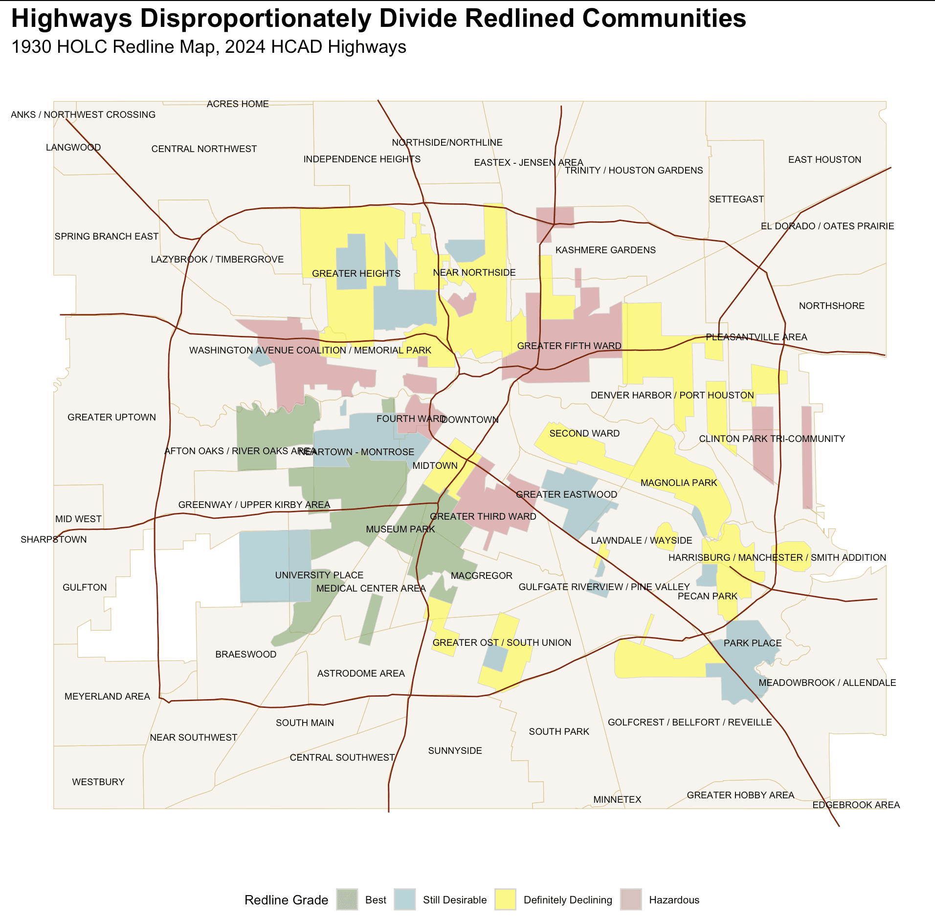
Redlining paints an vivid reality of how deep the roots of racial policy and discrimination can run. From health to finances to education to environmental, its effects have shown to permeate into every part of life for generations of Black families. One such example includes urban planning. The graph on the left depicts intersections between many neighborhoods deemed as "Declining" and "Hazardous" on the first redlining maps drawn in the 1930s and major highways.
However, redlining often does not always paint the full picture. If Houston's urban planning were truly racist, why is there a freeway cutting across one of the areas graded best?
People change, policy remains.
The communities that were initially living under redlined areas lived through hundreds of racial covenants, discriminatory bills disguised as welfare, and living conditions that worked against their existence. For example, with the construction of I-45, many residents of the Fourth Ward, once a thriving center for black culture, were displaced and moved to what is now the Third Ward. The map below depicts the areas graded a C or D in the original redlining map and compares it to where Black populations reside in Houston today.
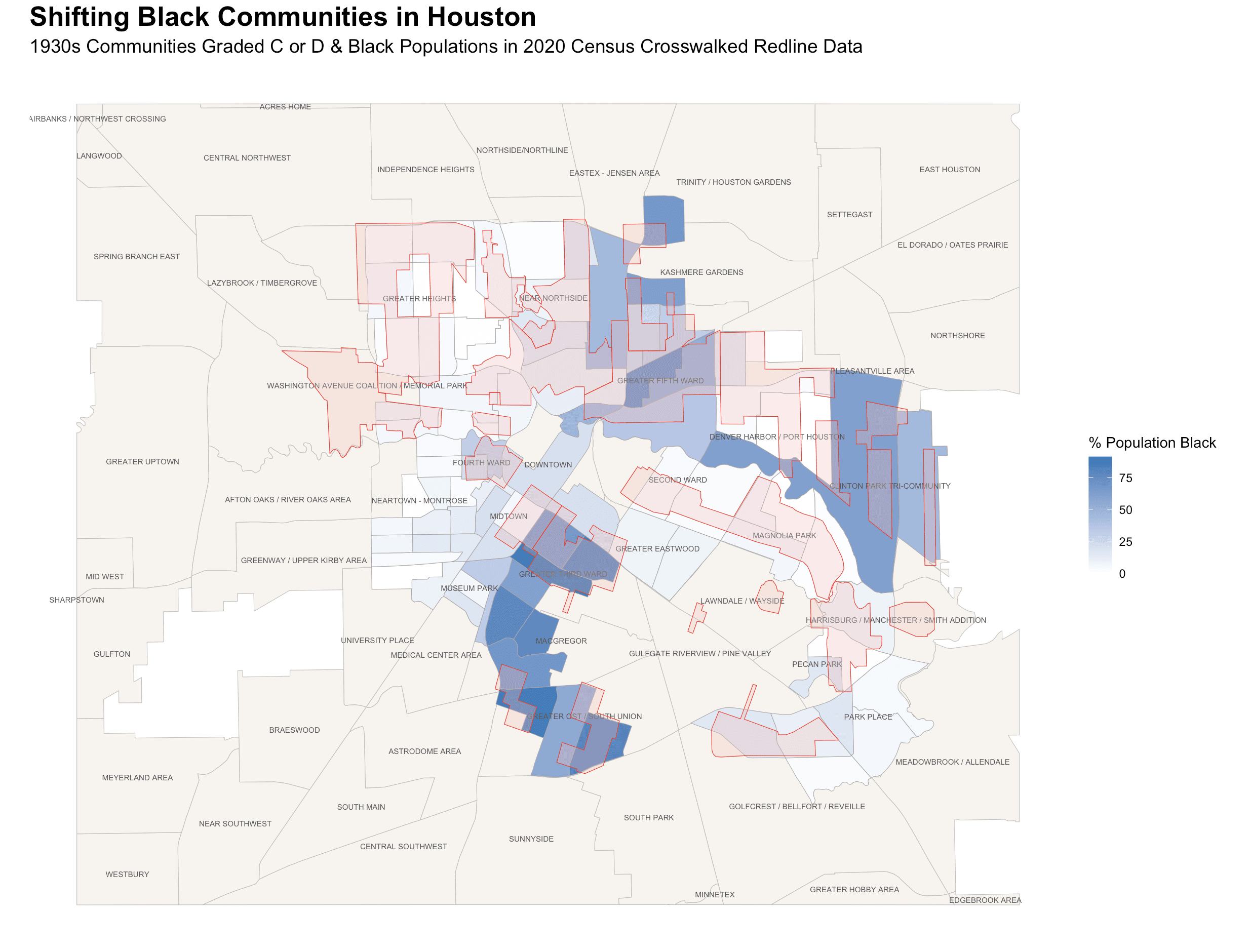
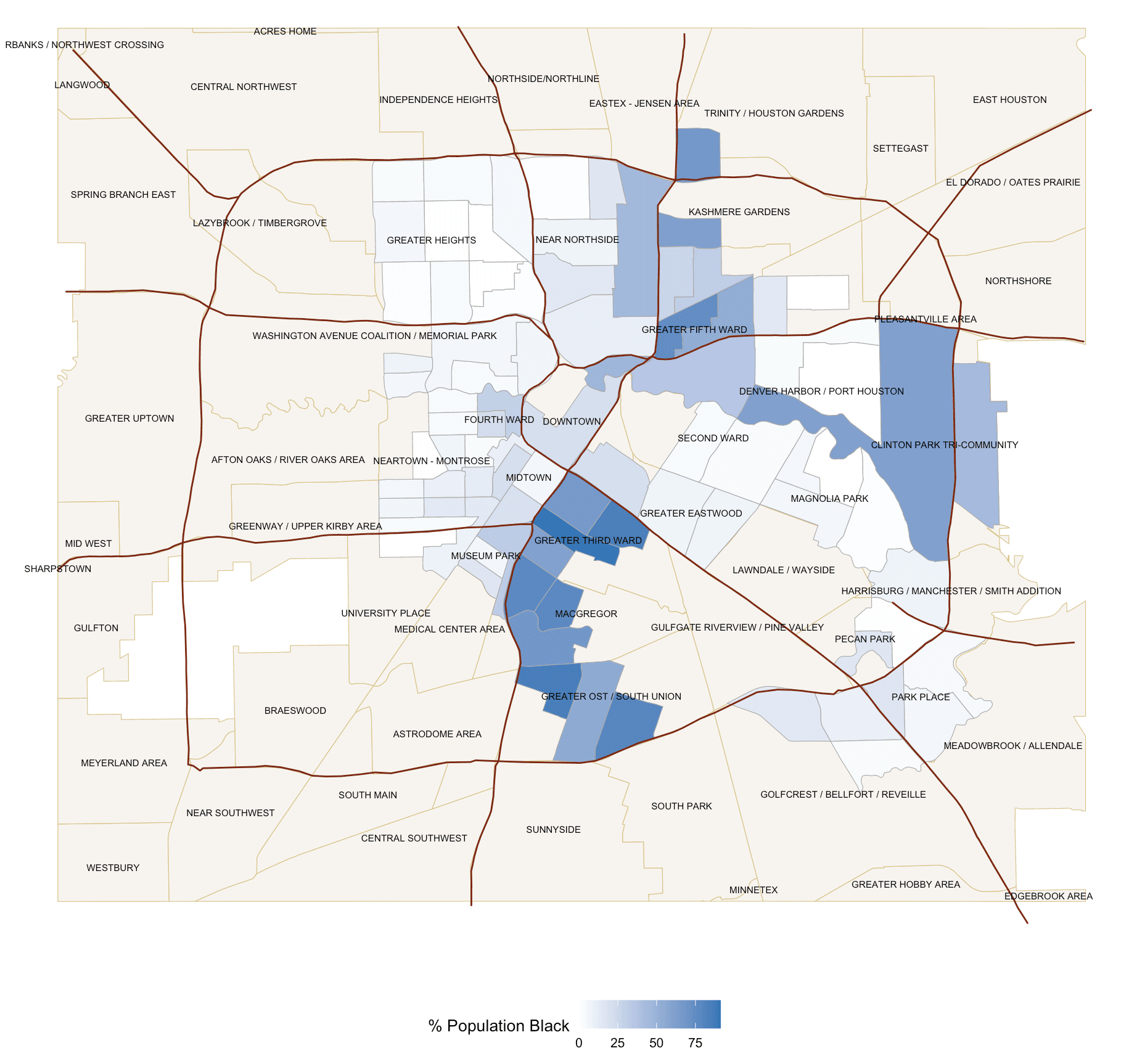
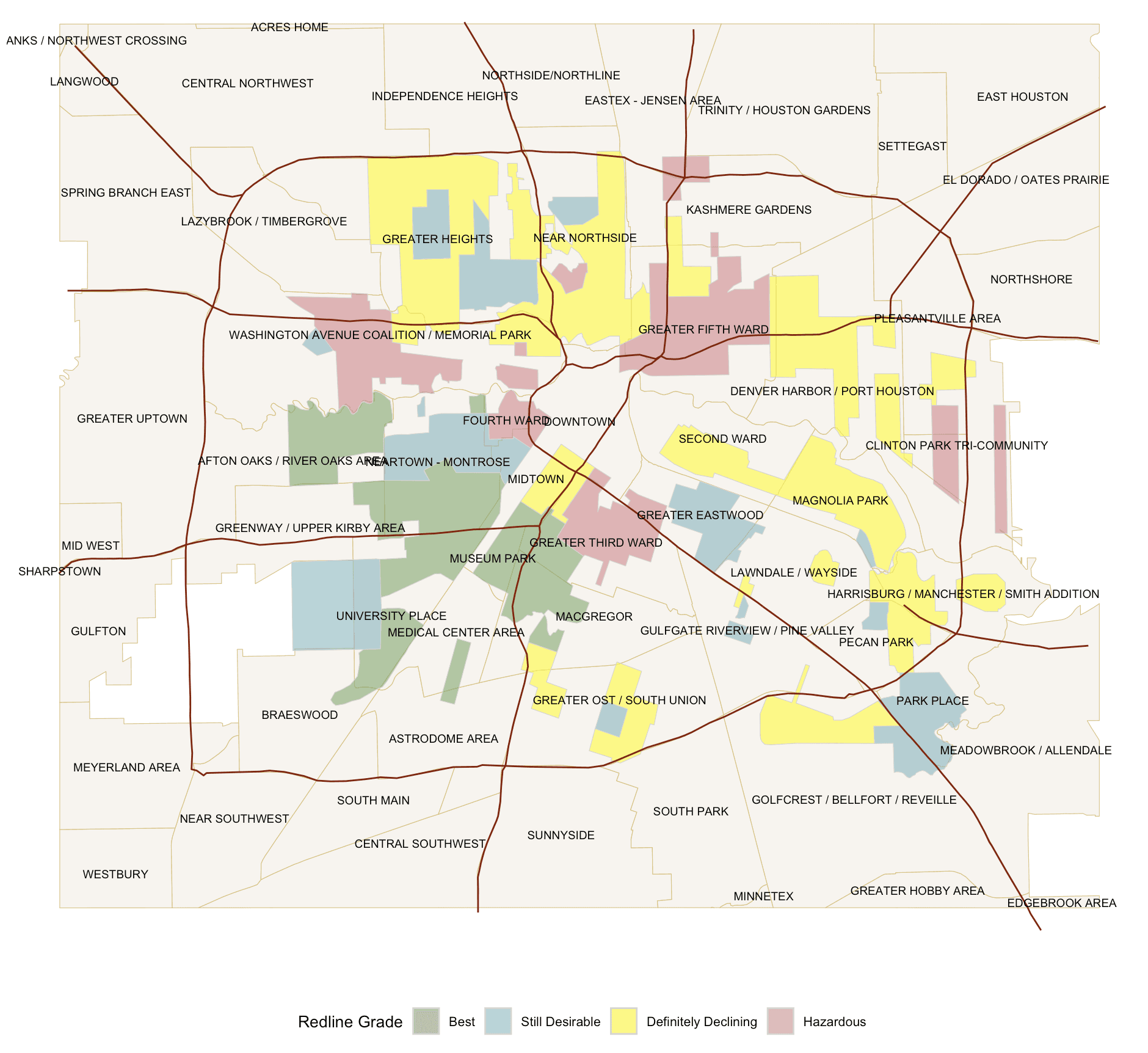
Taking another look at both graphs (left - Black population gradient, right - Redlined map), it is evident that the full story can't be understood by just looking at one or the other. For example, when examining the graph on the right, one could argue that there is a highway splitting the Museum Park and Greater Third Ward area, despite much of it being designated an A as a redline grade. However, closer analysis using the left map reveals that this highway was built right alongside, what is today, a predominantly Black community, acting as a divide between the two sides of the highway that have vastly opposite demographic profiles.
Highways and urban planning are continually built across years, and efforts to disadvantage Black communities are built alongside them. This kind of dual explanation requires understanding the implications redlining has posed as well as the effects it has had on displaced community members and Houston's Black community.
Modern manifestations
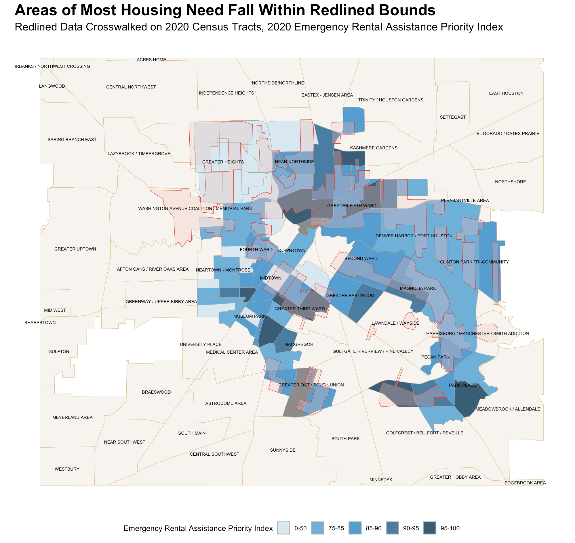
In the graph to the right, areas ranked C or D in the original redlining map are projected onto 2020 census tracks adapted to visualize what modern redlined boundaries would look like. These were then colored on an index representing high or low priority housing need. The regions with the highest housing vulnerability almost always fall within a redlined region (with a few outliers that are explained in other sections).
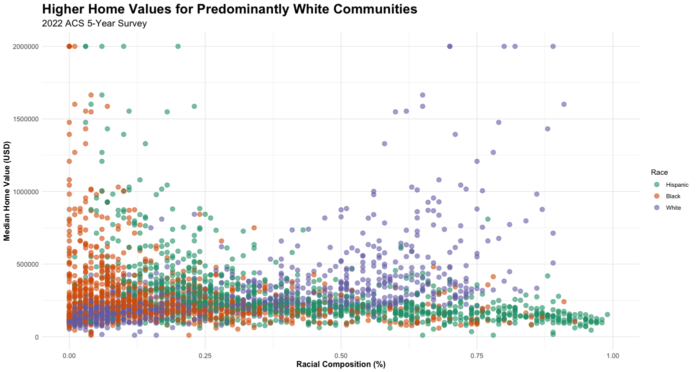
In order to fully understand how redlining and racial housing policies have exacerbated housing inequity in Houston, I wanted to zoom in on one manifestation of the housing disparity — median home values. The graph below visualizes how median home values change depending on racial composition of the census tract. The overall trend demonstrates that median home values are highest in communities with higher White population and lower Black & Hispanic populations.
Racial covenants, appraisal bias, private lending practices, zoning practices and a plethora of other racial housing policies have contributed towards homes owned by minorities being de-valued and high rates of renting.
I grew up in a Houston suburb and spent the first 2 years at Rice living on campus. This year, I moved off-campus to a house located in the Third Ward. Despite being less than a ten minute drive, witnessing the change in infrastructure, walkability, and scenery was jarring.
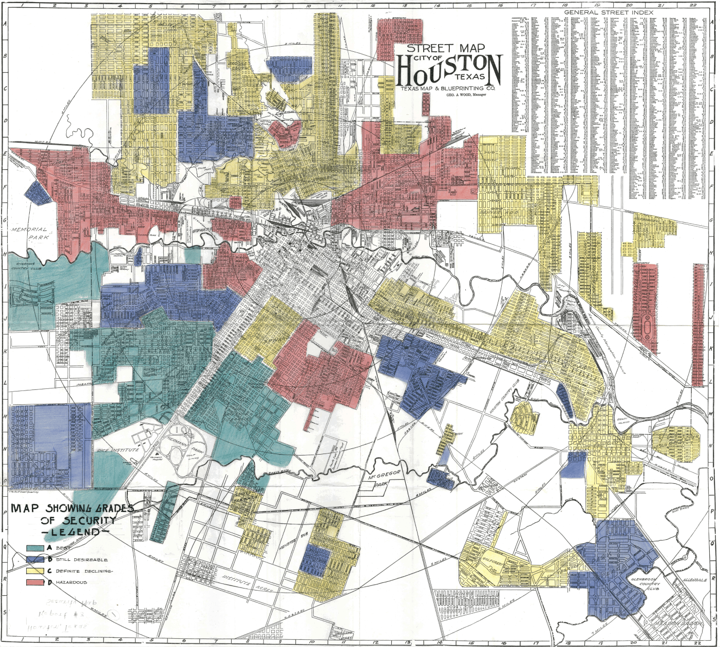
It's no coincidence that all the most desirable places to live in the 1930 HOLC redline map are located right around the perimeter of Rice. The "Rice Bubble" is often thrown around as a joke, but the bubble of investment and ignorance for the communities immediately surrounding our campus are sinister truths that allow this bubble to exist. Harmful investment extends beyond a map made in the 1930s and continues to be real and perpetuating today. As members of the Rice community, we all have a responsibility to educate ourselves on how Rice is impacting Houston communities not even 10 minutes away, advocate for equitable investment that works alongside these communities, and not turn a blind eye.

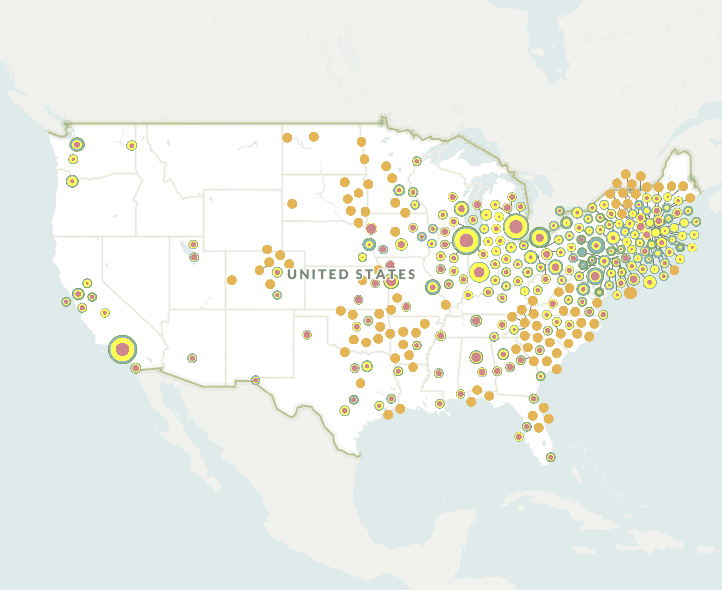
Source: Mapping Inequality
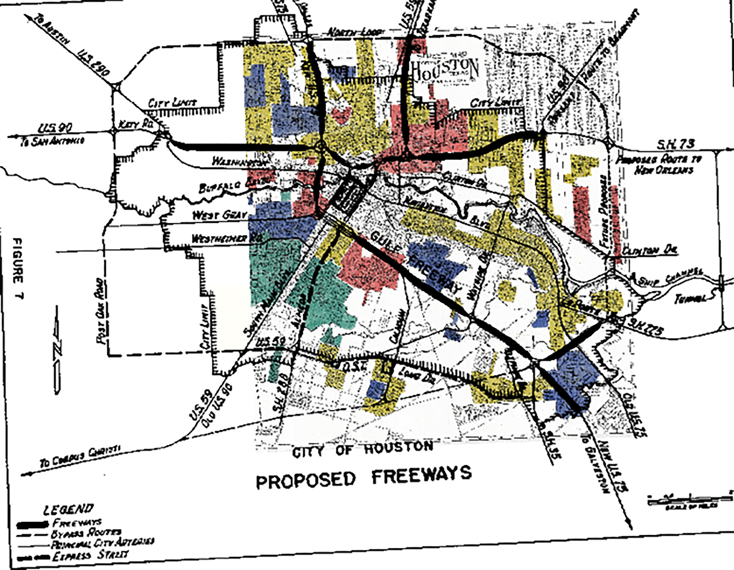
Source: Drwenski, Ettore Gardin Franco, and Sousa, “roadsTaken.”
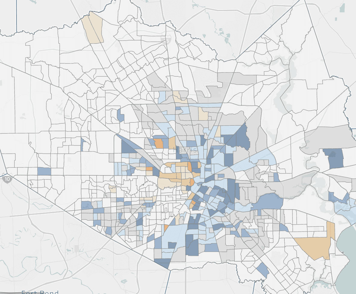
Source: Neighborhood Gentrification